Your desktop is the first thing you see every morning and the backdrop for hours of work, gaming, or creative sessions. So why settle for a wallpaper someone else decided looked good? Generic packs are made to appeal to everyone, which means they appeal to no one in particular. If you have a carefully tuned color scheme, a specific aesthetic you have been building, or a mood you want to maintain throughout your day, your wallpaper should be part of that equation, not an afterthought.
Why Generic Wallpaper Packs Keep Letting You Down
Browse any major wallpaper site and you will find thousands of options. The problem is that most of them were created with no particular setup in mind. A deep blue abstract piece might look stunning on a monitor calibrated a certain way, but clash badly with a warm amber taskbar and orange accent colors on another.
The issue is context. A wallpaper does not exist in isolation. It sits behind your icons, your taskbar, your dock, your widgets. It interacts with your system fonts, your window borders, your terminal color scheme. Every element either harmonizes or fights with everything else. Generic packs cannot account for your specific combination of preferences, and that mismatch is often subtle enough that you cannot name it but obvious enough that something always feels slightly off.
This is why more people are moving toward generated or customized wallpapers rather than downloaded ones.
Starting With Style Presets That Already Understand Color
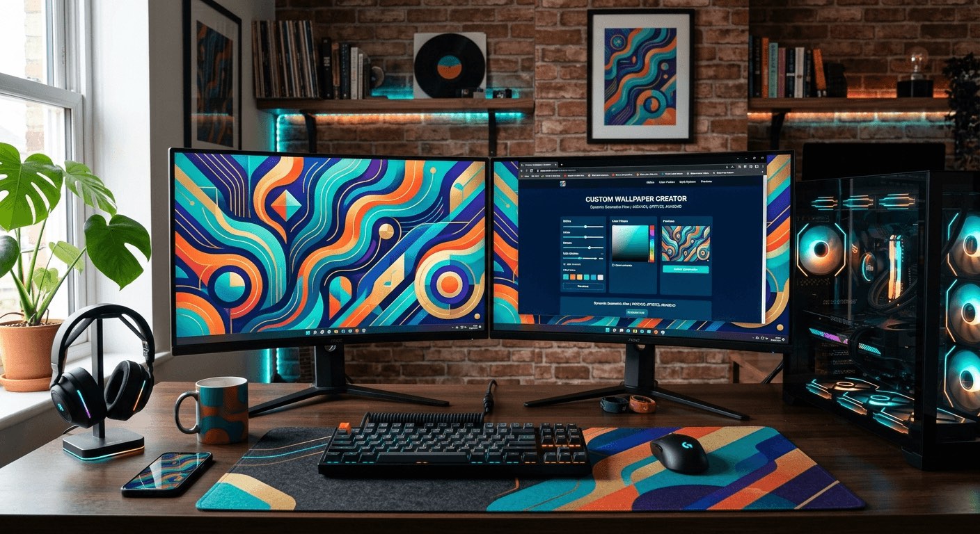
One of the biggest friction points in creating a custom wallpaper is not knowing where to start. You have a vibe in mind, maybe something minimal with cool greys, or dark academia with warm browns and gold tones, but translating that into a concrete visual is hard without design experience.
Template galleries built around style matching solve this. Browsing an AI wallpaper template gallery gives you a collection of style-matched presets, each one designed with a specific aesthetic in mind. You can scan through options that already represent moods like cyberpunk, cottagecore, minimalist, dark fantasy, or neon noir, and choose the one that fits your setup's vibe before you generate anything.
The advantage here is that the creative direction is already done. You are not starting from a blank canvas and hoping something comes together. You are selecting a starting point that already speaks your aesthetic language, then customizing from there. That shift in approach makes the whole process feel much less overwhelming for people who know what they like but struggle to create it from scratch.
The Step-by-Step Process for Getting It Right
Working through a custom wallpaper generation does not need to be complicated. Here is a process that works whether you are setting up a dual-monitor gaming rig or a minimal productivity workspace.
- Write down your desktop's dominant colors. Open your color scheme settings, note your accent color, your background tone, and your text or icon color. Even three hex values give you a strong foundation to work from.
- Identify your aesthetic category. Are you going dark and moody, light and airy, retro and warm, or something futuristic? Naming it makes template selection much faster.
- Browse by style, not by what looks pretty in a thumbnail. A wallpaper that looks stunning on its own can look terrible behind your actual taskbar. Filter by mood or palette first.
- Select a template that uses colors close to your scheme and generate a high-resolution version. Most tools let you specify exact dimensions, so match your screen resolution exactly rather than letting it stretch.
- Preview it in context. Take a screenshot of your desktop with the wallpaper applied and look at how it interacts with your icons, widgets, and open windows. Adjust the style or tone if something clashes.
- If the first attempt is close but not quite right, regenerate with a more specific prompt or adjust the style weight before committing.
Following these steps in order prevents the most common mistakes, specifically choosing something that looks good in isolation but breaks the cohesion of your overall setup.
Turning a Personal Photo Into Something That Fits
Sometimes the right wallpaper already exists in your photo library. A shot you took on a trip, a photo of your cat in perfect lighting, an architectural photo you captured on your phone. The raw photo might not feel like a wallpaper, but with the right style applied it can become exactly that.
Applying image restyle to a personal photo changes the equation entirely. Rather than using the image as-is, you apply an artistic treatment. Cinematic styles add drama and a color grade that makes a photo feel like a film still. Watercolor treatments soften everything and create a painted, organic feel that works beautifully behind minimal desktop setups. A minimal style strips the image back to its essential shapes and tones, making it much easier on the eyes during long working sessions.
The key is matching the style to your setup's existing personality. A cyberpunk-themed setup does not benefit from a watercolor treatment. A warm, cozy productivity setup does not need a cold cinematic grade. Think about the relationship between the art style and the mood you have already established with your other customization choices, and use the restyle function to bridge the gap between a photo you love and a wallpaper that works.
Resolution and Aspect Ratio Matter More Than You Think
A wallpaper generated at the wrong resolution is going to look soft, stretched, or cropped in ways that cut off the most interesting parts of the image. Most screens today are either 1080p, 1440p, or 4K, but ultrawide monitors and multi-monitor setups add their own complications.
Specifying your exact pixel dimensions upfront is the single most important technical decision in this process. A 2560x1080 ultrawide needs a completely different composition than a 3840x2160 4K display. The focal point of the image, whether it is a landscape horizon or an abstract geometric form, needs to sit in the right place relative to where your icons and taskbar live on your specific setup.
Aspect ratio also affects how a generated image feels. A taller composition on a standard 16:9 screen can feel claustrophobic if the visual weight sits in the center. A wider, flatter composition gives breathing room and keeps the desktop feeling open. These details are small, but they separate a wallpaper that feels fitted from one that feels like it was designed for someone else's screen.
Color Harmony Between Your Wallpaper and Your UI
Getting your wallpaper right is only half the equation. The other half is making sure it agrees with the rest of your interface. This means thinking about color harmony, which is the relationship between colors that either creates visual tension or visual comfort.
A wallpaper with a lot of warm orange and red tones is going to clash with a cool blue accent theme. A dark green forest scene might look great with earthy brown dock icons but conflict with a white minimal taskbar. Spending a few minutes on color palette design concepts helps you make these judgment calls without second-guessing yourself constantly.
The simplest rule is to choose a wallpaper where at least one dominant color matches or closely complements your desktop accent color. If your system uses a teal highlight, look for wallpapers with teal, green, or blue as a significant tone. If your accent is warm gold, lean into amber, brown, or rust palettes. This one constraint alone eliminates most of the awkward mismatches that make a desktop feel unfinished.
Keeping It Feeling Fresh Without Starting Over
One of the underrated benefits of generating wallpapers rather than downloading them is that regeneration is fast. If you get tired of your current wallpaper after two weeks but still love the general aesthetic, you can generate a new variation in the same style rather than hunting through another wallpaper pack.
This flexibility is especially useful for people who rotate wallpapers seasonally or to match different moods during the week. You can maintain a consistent style while changing the specific image, keeping your setup feeling cohesive even as individual elements shift. That kind of adaptability is simply not available when you are working from a fixed library of downloaded files.
It also means that getting one wallpaper right teaches you the process for every wallpaper after it. The second generation is always faster than the first.
Your Desktop, Finally Built Around You
A wallpaper is a small thing on its own. But multiplied across every hour you spend at your computer, it shapes the atmosphere of your entire digital space. Getting it right, genuinely matching it to your color scheme, your screen dimensions, your aesthetic, and your personal taste, makes a difference that you feel even when you are not consciously thinking about it.
Generic packs are convenient, but they are not yours. Building something that fits your setup specifically is easier than it has ever been, and the result is a desktop that feels assembled with intention rather than assembled from whatever happened to be available. Start with your color scheme, pick a style that already fits your aesthetic direction, get the resolution right, and adjust until everything on screen is working together. That is the whole process. It just takes a little more care than clicking download.